
Autism Isn't a Line — It's a Pie Chart
For decades, we've talked about autism using the language of a line: "high-functioning" or "low-functioning," "mild" or "severe," level 1 through level 3. It's an intuitive way to think about things — more of this, less of that, everyone lined up somewhere between two poles. The problem is, it doesn't actually reflect how autism works, and it can do real harm to the people living with it.
The trouble with a straight line
A linear model implies that someone diagnosed as "level 1" is having an easier time than someone diagnosed "level 3." In practice, that's often not true. A person who can hold a job, live independently, and pass as neurotypical in a meeting might still be dealing with debilitating anxiety, sensory overload, or meltdowns behind closed doors — things a linear scale has no room to capture. As one clinician and researcher who works with autistic women put it, thinking about autism as a simple line from "mild" to "severe" is little comfort to level 1 autistic people whose symptoms affect nearly every part of their lives, and this group actually faces elevated rates of mental health struggles, career difficulties, and bullying.
Autism researchers and self-advocates have been pushing back on this framing for a while now. A 2021 viewpoint piece for GPs in the Australian Journal of General Practice, co-authored by autistic researchers, warned that functioning labels "overlook the real challenges and barriers of autistic people who may not outwardly appear different," while also minimizing the strengths and capabilities of those with higher support needs. In other words: the line flattens people in both directions.
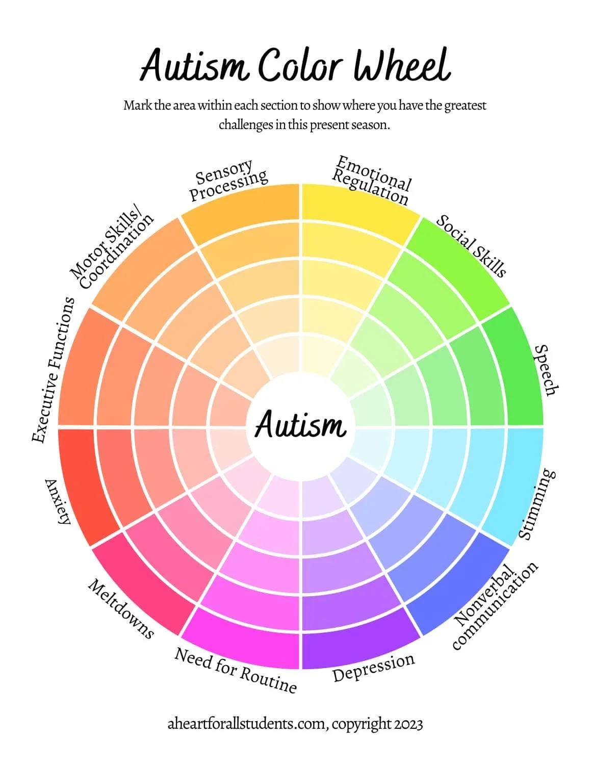
A different shape: the pie chart
An alternative that's gaining traction among clinicians is the "autism wheel" or pie-chart model — essentially a wheel-of-life exercise adapted for autistic traits. Instead of one score from 1 to 10, each trait (eye contact, social communication, sensory sensitivity, need for routine, executive function, restricted interests, stimming, anxiety, meltdowns) gets its own slice, each rated independently.
The result is a visual profile that's unique to each person. Two autistic people can have wildly different-looking wheels — one might score high on sensory sensitivity and low on social anxiety, another the reverse — and both are equally, fully autistic. Neither is "more" or "less" so. This tracks with where autism research itself has been heading: rather than searching for a single autism that varies only in degree, a growing number of researchers now think in terms of multiple "autisms," grouping people by shared clinical, genetic, and neuroanatomical features rather than by where they fall on one continuum.
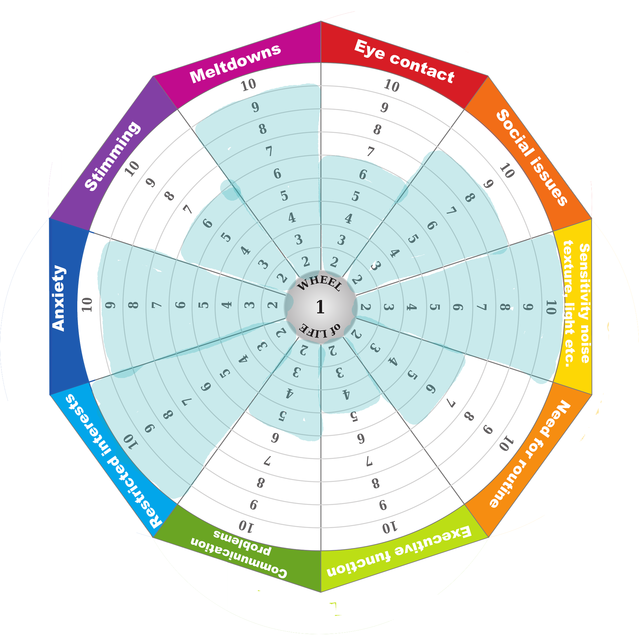
Source: Claire Jack Ph.D
Why the shift matters
This isn't just a semantic preference — it changes how support gets designed. A linear, severity-based model tends to trigger one-size-fits-all responses ("level 1 doesn't need much support"). A multidimensional model asks a more useful question: which specific areas is this person struggling in right now, and what would help there? That's a far better starting point for therapy, accommodations at work or school, or even how a family talks about a new diagnosis.
It also does something quietly important for autistic people themselves: it replaces a hierarchy with a profile. There's no "good" autism or "bad" autism in a pie chart — just a shape that's allowed to shift over time as someone grows, gets support, or moves through different life stages.
The takeaway
If you or someone you love is autistic, it might be worth setting the "high/low functioning" language aside and asking a different question: which slices of the pie feel biggest right now, and which supports would actually shrink them? That's a conversation our therapists are glad to have — whether you're newly diagnosed, supporting a family member, or just trying to understand yourself a little better.